Semplicita Pro
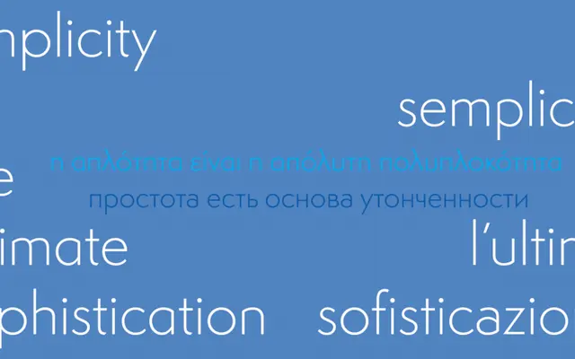
A new sans-serif design reappraising Alessandro Butti's 1930 Semplicità, replacing Futura's geometric rigidity with calligraphic warmth drawn from Italian Renaissance letterforms.
About
Semplicita Pro takes Butti's Nebiolo face as a departure point rather than a source to copy, using it to argue that geometric sans-serifs gain character when their formal structure is loosened in favour of calligraphic drawing. Only a few characters retain a hint of geometric perfection; the rest are handled in a manner the foundry traces to Renaissance rather than Bauhaus sensibilities. The design positions itself between three established sans-serif categories rather than belonging cleanly to any one of them.
Classification
New design reappraising Semplicità by Alessandro Butti (Nebiolo, 1930). Blends geometric, humanist and gothic sans-serif characteristics with calligraphic letterforms drawn from the Italian Renaissance rather than the Bauhaus.