displayorganic display
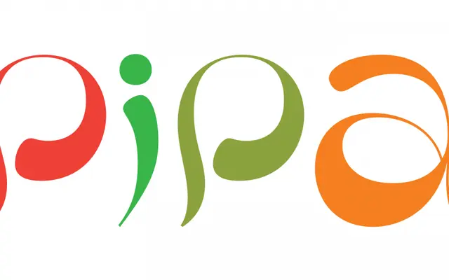
An organic display face originally designed for a health food retailer, drawing on cold type and photo-lettering sources for a flowing thick-and-thin construction.
About
Pipa originated as a commissioned typeface for a health food store chain and reflects a current vernacular in organic packaging typography. Its thick-and-thin contrast is handled unusually, with the variation appearing to emerge from within each stroke rather than being imposed by a broad-nib model, and a reduced stroke count keeps overall settings open and lively. The family includes a range of alternates.
Classification
Custom typeface originally made for a retail client; draws on cold type and photo-lettering sources. Thick-and-thin contrast flows from within strokes. Includes alternates.
Languages
Latin
Tags
organicdisplaypackagingpsychedelicthick-thin