Lincoln Electric
Canada Type · Thomas Lincoln
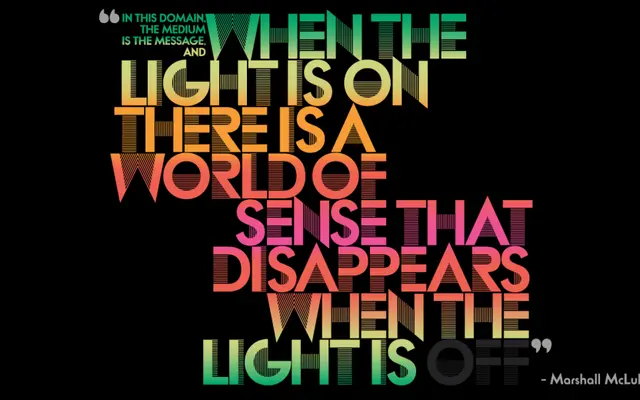
An all-capitals display face rooted in late-1960s experimental film type, reworking Cassandre's Bifur toward a more minimalist geometry.
About
Originally drawn by Thomas Lincoln on illustration board using pen, ink and press-type lines as in-house promotional type for his own design practice, Lincoln Electric takes Bifur's split-tone concept and steers it away from art deco ornament toward cleaner, more reductive forms. The result sits at the intersection of mid-century commercial lettering and modernist graphic design. Its construction reflects the influence of Herb Lubalin's studio environment where Lincoln worked in the late 1960s.
Classification
All-caps, pen-and-ink origin; evolved from Cassandre's Bifur (1929) toward minimalist rather than art deco geometry.