Libertine Pro
scriptbrush script
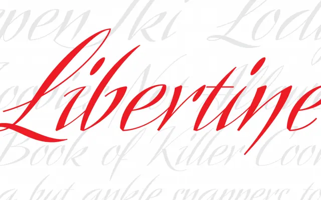
A high-contrast calligraphic script drawn from the commercial lettering of 1930s Dutch artist Martin Meijer.
About
Libertine Pro features steep stroke angles, extreme thick-thin contrast and three interchangeable character sets, giving it an assertive, expressive character. The font ships with over 1,160 glyphs, including alternates, ligatures and broad Latin language support. Its energy comes from the tension between disciplined calligraphic construction and abrupt, dynamic stroke transitions.
Classification
Based on 1930s Dutch commercial lettering by Martin Meijer; high contrast, steep stroke angles, calligraphic construction.
Languages
Latin
Tags
scriptcalligraphichigh-contrastbrushalternates