Informa Pro
sans-serifhumanist
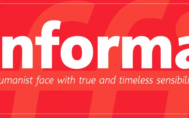
A humanist sans serif text family that balances calligraphic and geometric influences more evenly than most of its contemporaries.
About
Informa Pro draws on traditional lettering principles of contrast, proportion, rhythm and stroke to find a midpoint between the more calligraphic humanists and the geometry-favoured alternatives. The result pairs well with old style and transitional typefaces. It is designed for sustained text use rather than display.
Classification
Positions itself between calligraphic humanists like Gill Sans and geometric-leaning faces like Frutiger; maintains equilibrium of both influences
Languages
Latin
Tags
humanisttextsans-seriftraditionalpairing