Davis Sans
sans-seriftext sans
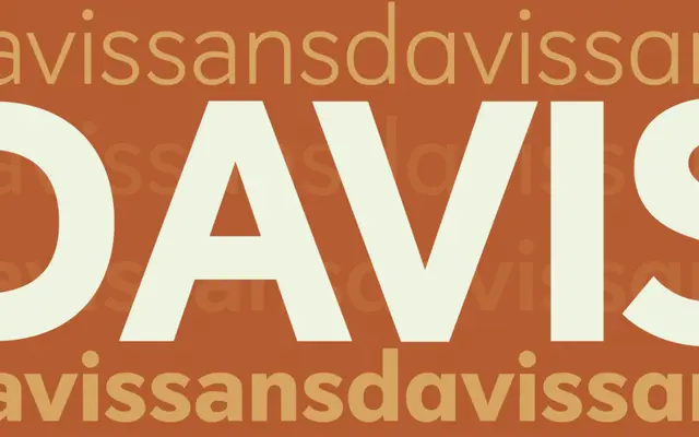
The sans-serif counterpart to Davis, applying the same focus on optical geometry and legibility to a gothic-style design for screen and print.
About
Davis Sans shares the foundational design rationale of its serif sibling, favouring clean counter-spaces and geometric control over decorative features. It is positioned for corporate, advertising and interface contexts where clarity at a range of sizes is a primary requirement. Like Davis, it treats classic type conventions as a starting point rather than a template.
Classification
Sans-serif companion to Davis, sharing the same design philosophy of optical geometry and counter-space focus for modern multi-platform environments.
Languages
Latin
Tags
textopticalmoderninterfacecorporate