Archie Pro
Canada Type · Martin Meijer
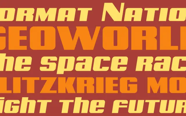
A wide, bold display face based on a geometric alphabet by Dutch lettering artist Martin Meijer from the early 1930s, expanded with unicase forms and broad Latin language support.
About
Archie Pro takes Meijer's original geometric letters and builds them into a two-font set with biform and unicase shapes, small caps and support for the majority of Latin languages. The upright styles rely on strong vertical strokes to project confidence, while the italics add a sense of urgency to the same forms. The typeface is designed strictly for display use, where its proportions and weight demand immediate attention.
Classification
Wide, bold geometric alphabet with unicase/biform characters and small caps; derived from a 1930s Dutch lettering source.