Aragon
Canada Type · Hans van Maanen
serifGaraldeitalic
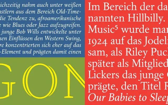
A two-weight text family drawing on sixteenth-century Garamond forms, reinterpreted with Dutch wedge serifs and tapered stems for sustained reading.
About
Aragon is built for continuous text, performing across sizes from footnotes to long body copy. Its wedge serifs and tapered stems give the letterforms a sturdy, legible quality, while a stress shift towards the upper portion of each character keeps the overall texture open. The family includes a standard two-weight set with corresponding italics and small capitals.
Classification
Based on mid-1500s Garamond forms, remodelled with wedge serifs, tapered stems and a slight stress shift to the upper half of characters; described as Dutch in character.
Family
RomanItalicSmall Caps
Languages
Latin
Tags
garamondrevivaltextdutchwedge-serif