Vandertak
Cake Type · Pieter van Rosmalen · 2023
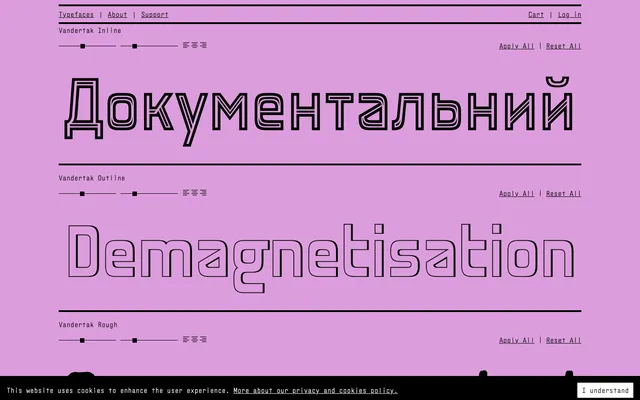
A digitisation of the 1916 monumental lettering on Rotterdam's Hotel New York, expanded into seven stylistic variants with Latin Extended and Cyrillic support.
About
The original letterforms were carved for the Holland Amerika Lijn building facade by Christiaan Bonifacius van der Tak, who deliberately thickened the horizontals so they would read correctly from street level. This optical correction gives the typeface its striking near-reversed-contrast appearance. Seven styles – Regular, Soft, Inline, Outline, Rough, Stencil and Stencil Applied – extend the historical source into a versatile display family.
Classification
Display typeface digitised from monumental architectural lettering dating to 1916, characterised by optically corrected heavy horizontals that mimic reversed contrast without technically being so. The stencil, inline, outline and rough variants confirm its display-first orientation.