EHV Baltan
Cake Type · 2026
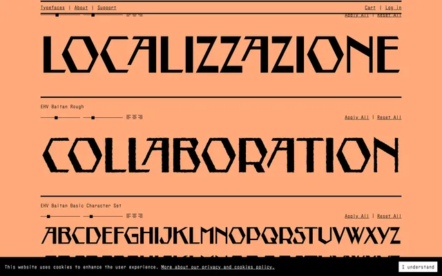
A two-style display typeface derived from 1923 architectural lettering on the Natlab Building in Eindhoven, built entirely without curves and animated by oblique rhythm and stroke contrast.
About
Every letterform in EHV Baltan is constructed from straight lines alone, cutting corners both as a formal strategy and a literal one: the result is a striking, angular texture that commands attention on page or screen. Thick-to-thin stroke contrast runs through an oblique rhythm, while automated alternate characters prevent unsightly gaps between neighbouring letters. The typeface comes in Regular and Rough styles, both covering Latin Extended, and takes its name from Dutch composer and theorist Dick Raaijmakers, known professionally as Kid Baltan.
Classification
Completely rectilinear letterforms with no curves, derived from architectural lettering. The angular, oblique rhythm and thick-to-thin stroke contrast place it firmly in the display category, with no conventional serif or sans-serif classification applicable.