Winkel
Brutal Types · Ramiro Espinoza · 2025
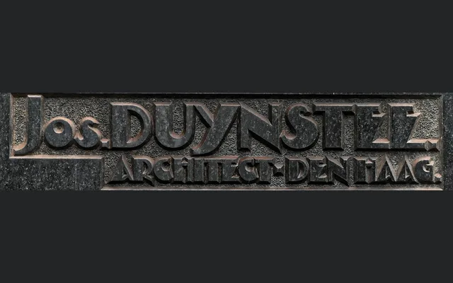
A single-weight display typeface reviving the bold, angular lettering from 1929 stone plaques in The Hague's Passage arcade, filtered through Amsterdamse School and Art Deco geometry.
About
Winkel is drawn from the sculptural public lettering of a 1929 expansion of The Hague's historic Passage gallery, where bold and slightly eccentric letterforms carry the dual influence of the Amsterdamse School and Art Deco. Ramiro Espinoza studied the original characters closely, preserving their expressive geometry and tension between ornament and function while extending them into a complete typeface. The result is suited to posters, brochures and branding that require a period character grounded in early 20th-century Dutch design.
Classification
A display typeface with bold, angular letterforms rooted in Amsterdamse School and Art Deco influences, designed for headline and branding use rather than continuous text.