Tikte
Brutal Types · Paula Mastrangelo · 2025
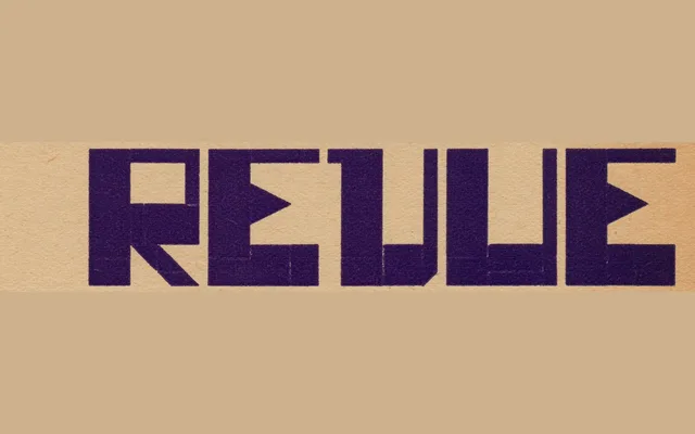
A single-weight display typeface rooted in the grid-based lettering of a 1931 Dutch printing trade magazine, expanded by Paula Mastrangelo into a full modular alphabet.
About
Inspired by the cover lettering of the November 1931 edition of Grafische Revue, the design translates a forgotten fragment of Dutch modernist typography into a usable typeface. Forms are deliberately blocky and unapologetically experimental, maintaining the original's visual tension between strict geometric structure and typographic rhythm. With just one style, it is suited to headlines, posters and identity work where graphic boldness takes precedence over versatility.
Classification
A radically modular, grid-based sans with blocky, squarish forms derived from avant-garde Dutch modernist lettering. Its extreme geometric construction and experimental character push it firmly into display territory.