Rebus
Brutal Types · Daniel Calder · 2025
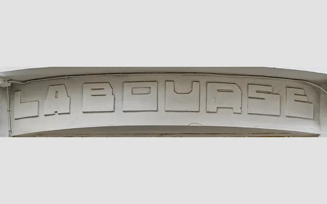
A curve-free, modular display typeface rooted in the architectural lettering of 1920s Dutch modernism, available in five widths from Condensed to Expanded.
About
Inspired by letterforms found on a building façade in Antwerp and extended with reference to alphabets created by Dutch architects in the 1920s, Rebus is constructed entirely from straight lines and right angles with no curves. The five-width family spans Condensed to Expanded, offering flexibility for applications in signage, posters, packaging and architectural print. Its uncompromising grid-based construction gives it a strong visual character that sits comfortably within early modernist design traditions.
Classification
A curve-free, modular display typeface built entirely from straight lines and right angles, placing it firmly in the geometric display category. Its construction draws directly from early 20th-century Dutch architectural lettering traditions.