Perpleja
Brutal Types · Ramiro Espinoza · 2025
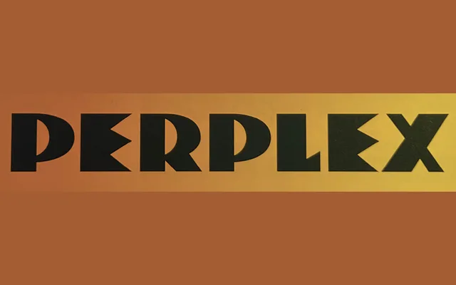
A single-style display typeface reviving an anonymous Dutch Expressionist logo from 1930, expanded by Ramiro Espinoza into a full contemporary alphabet with sharp angles and dramatic tension.
About
Sourced from a forgotten 1930 Dutch wordmark discovered in Steven Heller and Louise Fili's book Dutch Moderne, Perpleja translates a fragment of early Expressionist graphic history into a functional typeface. Its aggressive angles and raw letterforms sit awkwardly between geometric and organic traditions, lending the design an emotional ambiguity suited to logos, posters and album covers. The name, Spanish for 'perplexed', signals the typeface's resistance to easy categorisation.
Classification
A single-weight display typeface rooted in early 20th-century Dutch Expressionist lettering, characterised by sharp angles, dramatic stroke tension and radical letterforms that resist both geometric and organic classification.