Openbaar
Brutal Types · Paula Mastrangelo · 2025
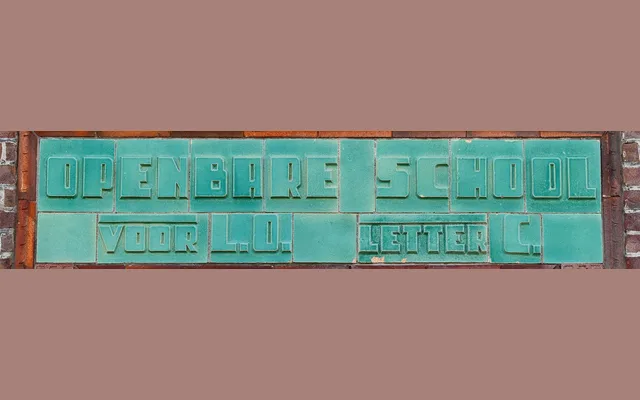
A single-style display typeface reviving the fat, modular lettering carved into the façade of a Dutch primary school in Voorburg, likely dating from the early 20th century.
About
Paula Mastrangelo traced the original inscription above the side entrance of the Public Elementary School Professor Casimir, preserving its rhythmic, module-based construction while expanding the letterforms into a complete alphabet. The result carries the weight and proportion of architectural stonecutting, making it well suited to editorial headlines, signage and packaging. With just one style, its usefulness is narrow but its historical specificity is a genuine strength.
Classification
A single-weight display typeface derived from modular architectural lettering, featuring fat geometric forms rooted in early 20th-century Dutch public signage. Its blocky, rhythmic construction places it firmly in the display category with no text-weight aspirations.