Ooievaar
Brutal Types · Ramiro Espinoza · 2025
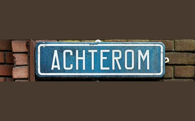
A constructivist sans revival by Ramiro Espinoza, drawn from the distinctive street name signage of The Hague and translated into a single-weight digital typeface.
About
Ooievaar takes its forms directly from the utilitarian street signage that has quietly defined The Hague's visual identity for decades. Squarish proportions, open counters and a compressed rhythm give it a precise, functional character suited to signage, editorial work and identity design. Named after the Dutch word for stork — the city's emblem — it packages a piece of civic typographic heritage into a contemporary release.
Classification
A squarish, compressed sans with constructivist leanings, derived from mid-century municipal signage. Its geometric, utilitarian forms and open counters place it within the constructivist branch of modernist sans-serif design.