Oldenhove
Brutal Types · Sabina Chipară · 2025
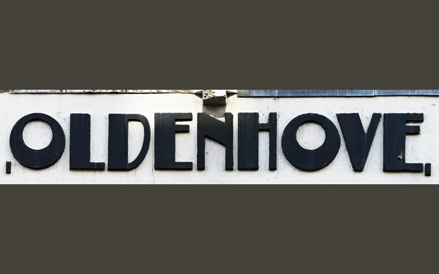
A single-style Art Deco display typeface drawn from the architectural lettering of Amsterdam School buildings designed by F. A. Warners in The Hague and Amsterdam.
About
Sabina Chipară adapted lettering from two Warners-designed facades, smoothing inconsistencies and standardising proportions to produce a coherent display face. Strong stroke contrast and a compressed vertical rhythm give it a formal, period-appropriate character suited to book covers, posters and branding that evokes the interwar decades. Coverage is Western Latin only, offered in a single style.
Classification
A compressed, high-contrast display typeface derived from architectural lettering in the Amsterdam School tradition, with strong vertical stems and a compact silhouette characteristic of 1920s–30s Art Deco lettering.