Neurus
Brutal Types · Ramiro Espinoza · 2025
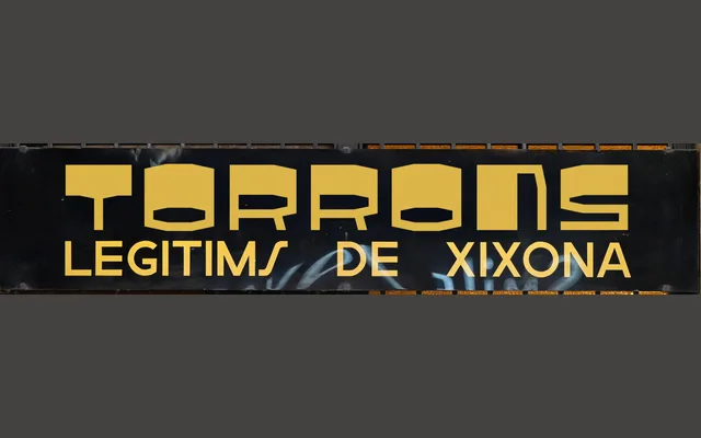
A single-style reverse-contrast display typeface by Ramiro Espinoza, modelled on the wide, exaggerated signage lettering found on Parisian and Barcelonian streets during the 1970s.
About
Wide proportions and an unusual weight distribution give this face its retro character, with heavy horizontals dominating over vertical strokes in the manner of expanded commercial lettering. The name references Professor Neurus, a villain from the 1970s Argentine cartoon Hijitus, signalling the designer's affection for the era's visual culture. Suited to editorial headlines, posters, festival communications and expressive branding.
Classification
A reverse-contrast display typeface with exaggerated horizontal strokes and wide proportions, drawing directly from expanded 1970s signage lettering. The unconventional weight distribution places it firmly in the display category.