Locrian
Brutal Types · Ramiro Espinoza · 2025
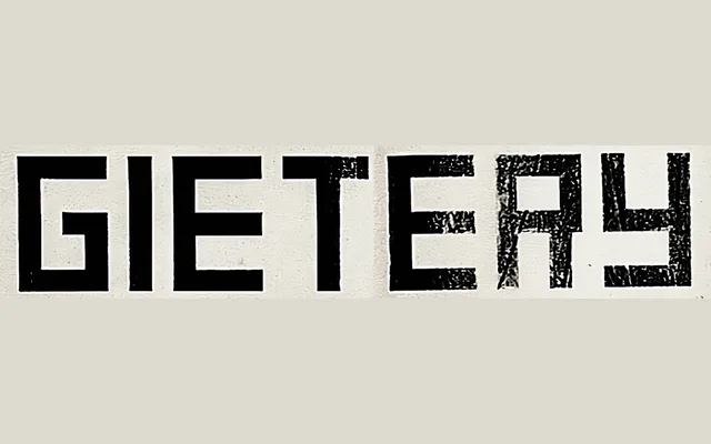
A single-weight geometric display typeface by Ramiro Espinoza, drawn in the spirit of Theo van Doesburg's De Stijl alphabets with expanded proportions and pared-back detail.
About
Inspired by van Doesburg's alphabets for the Amsterdam Tetterode foundry and Hagemeijer & Co., Locrian is not a direct digitisation but an interpretation of the same constructivist sensibility. Its expanded, economical letterforms suit editorial and branding contexts that reference 20th-century modernist movements, while remaining usable for contemporary or technology-oriented aesthetics. A single style is offered, reflecting the uncompromising minimalism of its source material.
Classification
A geometric sans-serif with expanded proportions and minimalist construction, inspired by Theo van Doesburg's De Stijl-era alphabets. Its economical, rectilinear forms place it firmly in the geometric display tradition.