Lachappelle
Brutal Types · Ramiro Espinoza · 2025
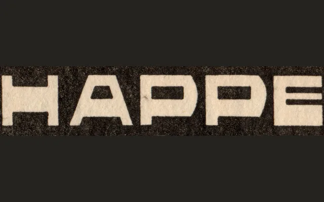
A revival of eccentric reverse-contrast lettering found in a vintage Dutch flooring advertisement, redrawn by Ramiro Espinoza in 2025 with expanded punctuation and accents for contemporary use.
About
The original alphabet, which bears a resemblance to work by Dutch artist and Resistance hero Chris Lebeau (1878–1945), is characterised by its reverse-contrast strokes and confident idiosyncrasy. Espinoza redrew the characters to address inconsistencies and added accents, punctuation and symbols, producing a single-style typeface suited to posters, branding and editorial display work. The result retains the historical oddity of its source while functioning as a properly equipped Latin typeface.
Classification
A reverse contrast display typeface, where horizontal strokes are heavier than verticals, giving it an eccentric, decorative quality rooted in vintage advertising lettering rather than conventional typographic tradition.