Kurversbrug
Brutal Types · Ramiro Espinoza · 2001
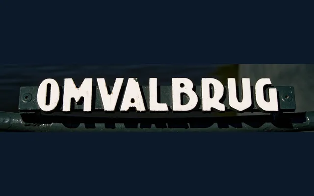
A revival of the lettering found on Amsterdam's iron bridge nameplates, attributed to Anton Kurvers of the Amsterdam School and translated into seven digital styles by Ramiro Espinoza.
About
The typeface reconstructs the heavy, low-contrast letterforms of the cast-iron bridge signs that line Amsterdam's canals, a system of signage attributed to Anton Kurvers (1889–1940) and associated with the Amsterdam School movement. Seven styles range from Light to Black, with a Rough variant preserving the textural irregularity of the physical originals. Its idiosyncratic forms and consistent rhythm make it well suited to signage, editorial work and branding that calls for a specific sense of place.
Classification
A display typeface rooted in early 20th-century Dutch vernacular lettering, characterised by heavy low-contrast strokes and idiosyncratic forms drawn from iron bridge nameplates. Its expressive, slightly irregular geometry places it firmly in the display category with a vernacular revival subcategory.