Kursus
Brutal Types · Ramiro Espinoza · 2025
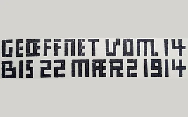
A single-weight display typeface inspired by the curve-free, modular lettering of Dutch designer Mathieu Lauweriks, reviving early Dutch modernist typographic experiments for contemporary use.
About
Drawn from historical ephemera associated with the Staatliche Handfertigkeitskursus in Hagen, Kursus reconstructs the systematic, grid-based letterforms that Lauweriks developed at the turn of the twentieth century. Its strict avoidance of curves and reliance on simple rectangular blocks give it an uncompromising geometric character that connects to the broader lineage of Dutch avant-garde design, visible in Wijdeveld's Wendingen and the architectural lettering of Amsterdam's Telegraaf building. With a single style, it is purpose-built for display use where formal rigour and historical resonance are required.
Classification
A neo-constructivist display typeface built entirely from simple geometric shapes with no curves, drawing on early Dutch modernist lettering traditions. The radical reduction to blocks and straight forms places it firmly in the display category with a geometric, modular subcategory.