Keuken
Brutal Types · Paula Mastrangelo · 2025
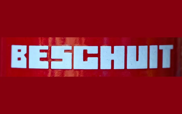
A single-style geometric display typeface inspired by the anonymous block lettering found on Dutch enamel kitchen canisters from the 1920s.
About
Paula Mastrangelo draws from the bold, modular letterforms once printed on domestic Dutch storage jars labelled koffie, thee and suiker, translating an anonymous vernacular tradition into a contemporary digital typeface with Western Latin coverage. The result sits between nostalgic and functional, suited to packaging, poster work and branding that calls for a confident, unpretentious character. At a single style, it is a focused artefact rather than a versatile system.
Classification
A single-style geometric display typeface with modular letterforms derived from early 20th-century Dutch enamel canister lettering. Its bold, constructed forms and limited stylistic range place it firmly in the display category rather than a general-use sans-serif.