Genootschap
Brutal Types · Ramiro Espinoza · 2025
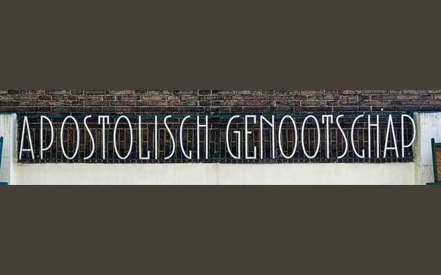
A single-weight display typeface digitised from the facade lettering of a 1920s Amsterdam School building, capturing its unusually refined Jugendstil proportions.
About
Ramiro Espinoza photographed and digitised the letterforms carved on the Apostolic Genootschap Watergraafsmeer building in Amsterdam, designed by architect Cornelis Kruyswijk around the 1920s. Unlike the modular, bold alphabets typical of the Amsterdam School, these letters show exceptional typographic finesse and a clear debt to Jugendstil. The result suits logos, editorial headlines, book covers and cultural institution work where a singular period voice is required.
Classification
Drawn from early 20th-century architectural lettering on an Amsterdam School building, the typeface shows clear Jugendstil and Dutch interwar avant-garde influence, placing it firmly in the display category with decorative, period-specific character.