Gedenk
Brutal Types · Paula Mastrangelo · 2025
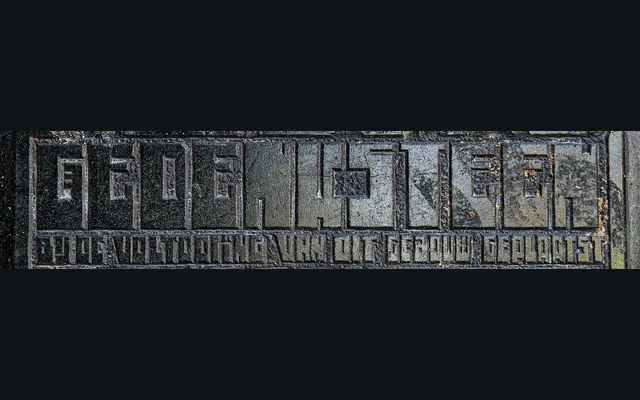
A single-weight geometric display typeface inspired by carved stone letterforms on a Dick Greiner-designed building in Amsterdam, tracing its formal logic back to the ruler-based systems of Lauweriks and Wijdeveld.
About
Drawn from an observed inscription at Rozengracht 229–231 in Amsterdam, the design translates the rigid modular geometry of early Dutch modernist architecture into a usable typeface. Paula Mastrangelo's construction preserves the rhythmic repetition and formal precision of the source material, giving it an ambiguity that reads as either archival or forward-looking depending on use. Suited to logos, editorial work and identity projects where geometric structure carries meaning.
Classification
A squarish, modular geometric sans with rigid ruler-based construction and rhythmic repetition, rooted in early 20th-century Dutch modernist lettering systems. Its single-weight, display-oriented character places it firmly in the display category.