Gebroken
Brutal Types · Ramiro Espinoza · 2025
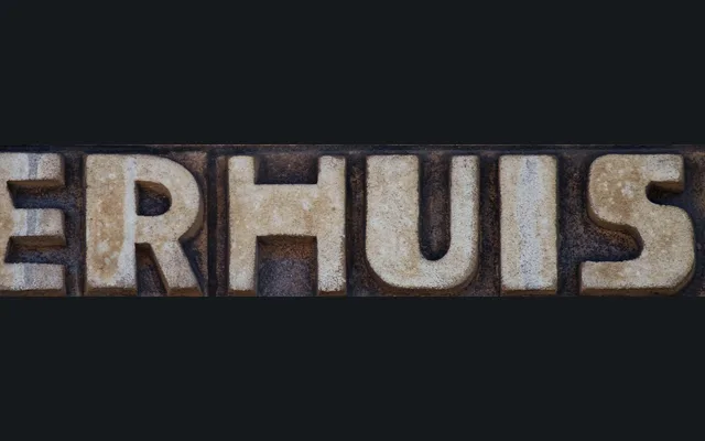
A 2025 revival of early twentieth-century Dutch institutional lettering, documented from buildings in Voorburg, Leiden, Wassenaar and Haarlem by Ramiro Espinoza.
About
Drawn from hand-lettered signage found in Dutch elementary schools and public buildings of the 1920s, Gebroken systematises an idiosyncratic regional style into a single usable typeface. Espinoza resolved inconsistencies in the source material and extended the character set to Western Latin coverage. The name references the angular break in the letter 'E', the most distinctive feature of the design, making it suited to posters, book covers and logotypes.
Classification
A single-weight display face drawn from early twentieth-century Dutch institutional lettering, with unusual constructed letterforms – most notably the angular 'E' – that place it firmly in the display category rather than any conventional grotesque or serif tradition.