Brouwer
Brutal Types · Ramiro Espinoza · 2025
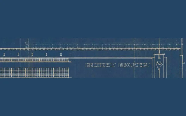
A display typeface drawn from a forgotten blueprint alphabet discovered on the original Heineken brewery façade drawings, attributed to Amsterdam School architect Bert J. Ouëndag.
About
Ramiro Espinoza found the source material while studying the brewery's original architectural plans: an unused letterform set in a style consistent with the Amsterdam School, almost certainly drawn by the building's architect. Rather than a literal reconstruction, Brouwer distils the essential qualities of that blueprint alphabet into a contemporary typeface suited to logos, editorial headlines and advertising. Sturdy proportions and a geometric structure give it an industrial character that remains legible and versatile.
Classification
A display typeface with sturdy, geometric proportions rooted in early twentieth-century Dutch architectural lettering, closely related to the Amsterdam School style. Its industrial character and upright structure place it firmly in the display category rather than functional text use.