Boer
Brutal Types · Ramiro Espinoza · 2026
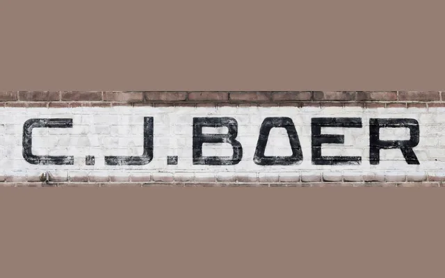
A single-style expanded sans-serif revived from 1940s hand-painted façade lettering on a former ice factory in Gouda, distinguished by unusually slanted-sided rounded capitals.
About
Ramiro Espinoza sourced the design from lettering on the Fa. C. J. Boer building at Vest 52–56 in Gouda, Netherlands, most likely painted around 1946 when the trading company took over the 1911 building. The capital O with slanted sides is the structural cornerstone of the alphabet, lending a highly original quality to every rounded letter. Espinoza refined the geometry and expanded the character set while keeping the broad, solid presence of the painted original.
Classification
A wide, single-weight sans-serif derived from hand-painted façade lettering, with broad proportions and an unusual slanted-sided capital O that governs the rounded letter construction. Its brushwork origins and industrial character place it firmly in the expanded grotesque tradition.