Baruch
Brutal Types · Ramiro Espinoza · 2025
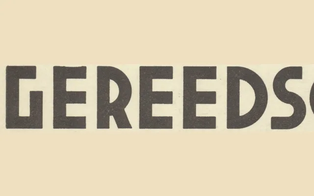
A single-weight geometric sans drawn from modular lettering on the cover of a 1938 Dutch metalworking handbook, refined into a clean digital typeface by Ramiro Espinoza.
About
The source material, a Dutch industrial handbook published in Haarlem in 1938, provided imperfect but characterful letterforms built on simple geometric principles. Espinoza preserved that directness while correcting proportions and expanding the character set to produce something both historically grounded and practically usable. The result suits posters, signage and editorial work where a rational, utilitarian voice is wanted without straying into the familiar territory of Futura or Gill.
Classification
A geometric sans-serif derived from modular, industrially constructed lettering from a 1938 Dutch technical handbook. The design retains the utilitarian geometry of the source material while refining proportions into a coherent digital typeface.