 MegaMegaTypeType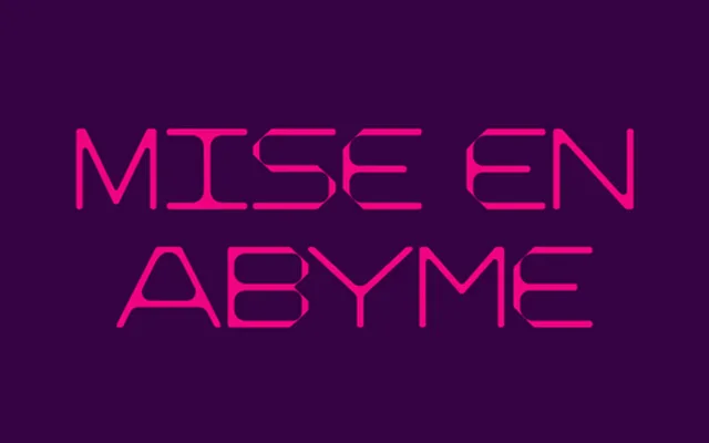
Drawn for a special issue of Arena Homme+ marking the Buffalo collective, and built from thin monolinear strokes that break where the geometry meets.
About
Buffalo takes its name and its brief from the Buffalo group, the stylists and photographers gathered around Ray Petri in 1980s London. The letterforms are monolinear and geometric, with joins left open so the construction stays visible at large sizes. It is a face for titling and identity work, at its best where the strokes can be given room.
Classification
A monolinear geometric display face built from open, stencil-like strokes with visible joins. Display rather than sans-serif: the counters and terminals are drawn for scale and atmosphere rather than continuous reading.
Weights
Regular
Optical sizes and widths
Display
Family
Buffalo
Languages
Latin
Tags
displaygeometricmonolinearstencilfashioneditorial