 MegaMegaTypeType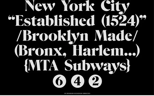
A high-contrast display serif with exaggerated vertical stress, hairline serifs and a playful typographic rhythm.
About
BN Mr. Miesha is defined by the extreme contrast between its thick strokes and razor-thin serifs, giving it a sharp, fashion-adjacent character that sits somewhere between Didone convention and graphic display experimentation. The exaggerated vertical stress and sculpted curves lend it a distinctive rhythm that works for editorial headlines, brand identity and bold typographic compositions. It is part of a small related family, with BN Miesha offered as an alternative variant.
Classification
High-contrast display typeface with exaggerated vertical stress, razor-thin serifs and sculpted curves; related to BN Miesha
Family
Languages
Latin
Tags
displayhigh-contrastserifeditorialbranding