 MegaMegaTypeType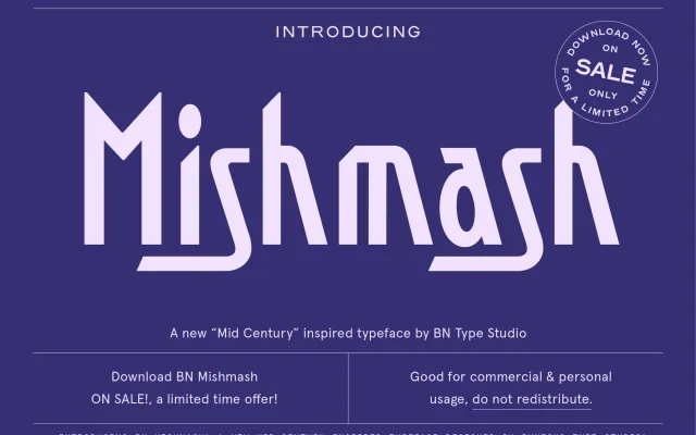
A bold, deliberately irregular display sans-serif built around unpredictable letterforms and a consciously playful character.
About
BN Mishmash is a display sans-serif that leans into inconsistency as a design feature, with letterforms that twist and deviate from convention. Its bold weight and eye-catching irregularity suit it to headline use in branding and poster work. The typeface makes no attempt at neutrality, trading polish for personality.
Classification
Bold, irregular sans-serif display face with deliberately unconventional letterforms
Languages
Latin
Tags
quirkyboldplayfuldisplaybrandingirregular