 MegaMegaTypeType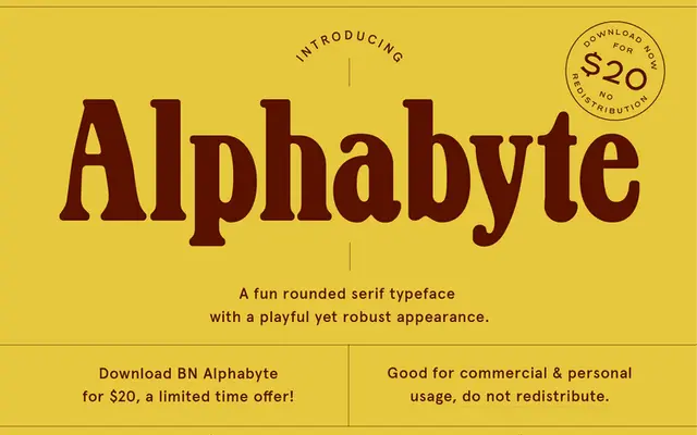
A bold display serif combining thick rounded serifs with strong stroke contrast for a playful but impactful appearance.
About
BN Alphabyte sits between serious and approachable, using high contrast between thick and thin strokes to create visual energy while rounded serifs soften the overall tone. The weight and contrast make it well suited to headlines and short display text where legibility at size is needed. It is a single-style release aimed at designers who want impact with a light touch.
Classification
Bold serif with thick rounded serifs and high stroke contrast; playful display character
Languages
Latin
Tags
displayserifboldroundedhigh-contrast