 MegaMegaTypeType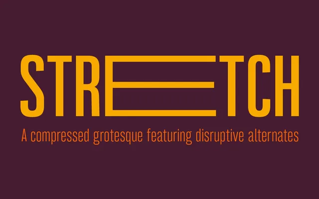
A compressed grotesque spanning eight weights, drawn from the tradition of wood-block screen-printing sans serifs and suited to both headline and body use.
About
Bw Stretch takes its formal cues from early wood-block screen-printing letterforms, producing a narrow grotesque that works comfortably from display sizes down to body text. Eight weights run from Thin to Heavy without italics, covering extended European Latin. OpenType features include small and petite caps, discretionary ligatures, case-sensitive forms, fractions and disruptive titling alternates via Stylistic Set 01.
Classification
A compressed grotesque inspired by early wood-block screen-printing sans serif lettering. Its narrow proportions and even stroke weight place it firmly within the condensed grotesque tradition, designed primarily for display use.