 MegaMegaTypeType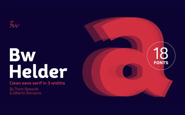
A spurred sans-serif in three widths and six weights, developed from a piece of historical ornamental lettering with its decorative details reworked for functional legibility.
About
Designed collaboratively by Thom Niessink and Alberto Romanos, Bw Helder draws on an old lettering specimen whose ornamental serifs have been reduced to subtle spurs branching from the stems. The result sits comfortably across branding and editorial contexts, balancing a friendly tone with the composure needed for extended text at small sizes. Eighteen styles across three widths offer considerable flexibility for varied applications.
Classification
A clean sans-serif with subtle curve treatments and distinctive spurs branching from stems, giving it a character between humanist warmth and functional restraint. The spurred details derive from tamed ornamental lettering, situating it closer to humanist traditions than geometric or grotesque models.