Rotwang
Bfgs.Studio · Guido Schneider · 2018
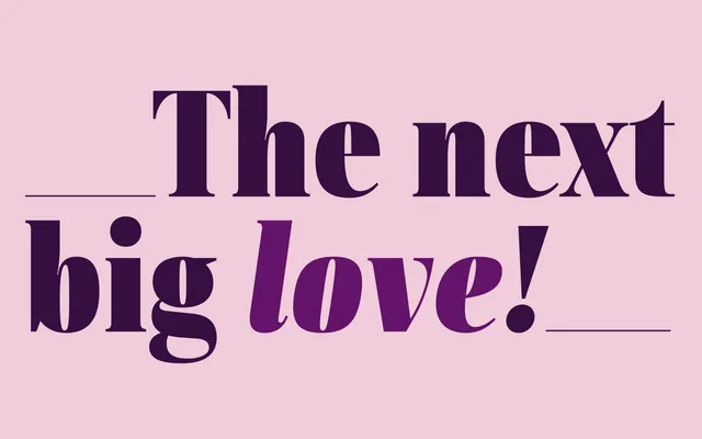
A high-contrast transitional serif with Didone influences, named after the inventor character from Fritz Lang's Metropolis, spanning seven weights with matching italics and over 1,350 glyphs per font.
About
Rotwang is a redesigned and expanded edition of an earlier typeface by Guido Schneider, released in updated form in 2024. Slightly condensed proportions give it a compact efficiency across all weights, with lighter cuts suited to continuous text and heavier weights carrying enough contrast for display use. Each font includes small caps, multiple figure sets, over 35 ligatures and style sets for alternates, with coverage extending to more than 200 Latin-based languages.
Classification
Rotwang blends high-contrast transitional serif characteristics with Didone-style forms, featuring pronounced stroke contrast and slightly condensed proportions throughout all weights.