Konkret Grotesk
Bfgs.Studio · Guido Schneider · 2018
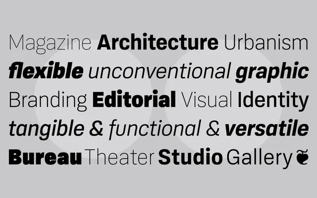
A slightly squarish neo-grotesque from Guido Schneider, available in eight weights with matching italics and extensive OpenType features across 1,564 glyphs per font.
About
Originally conceived as a Neue-edition of Schneider's earlier squarish Neo-Grotesque, Konkret Grotesk covers a broad range from delicate Thin to heavy Black, making it serviceable at both text and display sizes. Eleven style sets allow typographic adjustment including switching slanted italics to true italic forms. Language support extends across more than 220 Latin-based languages, with small caps, seven figure sets, fractions and multiple ligatures included throughout.
Classification
A neo-grotesque in the tradition of Neue Haas Grotesk and its kin, with a slightly squarish character that distinguishes it from more neutral grotesques. Eight weights with matching italics, including optionally true italics via style sets.