Agneta
Bfgs.Studio · Guido Schneider · 2025
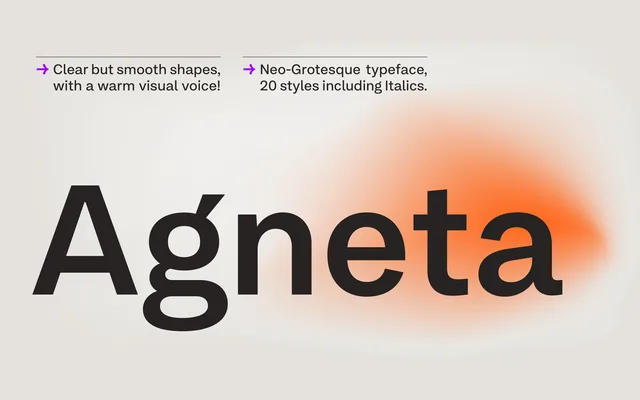
A neo-grotesque family in 10 weights with matching italics, drawing on early printed sans-serif sources to balance geometric clarity with a warmer, more personal voice.
About
Designed by Guido Schneider and released in 2025, Agneta takes cues from old printed matter and a board game logo, refining those references into a contemporary grotesque with a generous x-height and smooth curves. Extensive stylistic sets allow the typeface to shift between a warm, expressive register and a more neutral, crisp one by switching between alternate forms for a, g, l, r, y, R and Q, as well as round or square punctuation. With 1,834 glyphs per font and coverage of hundreds of Latin-based languages, the family is built for demanding multilingual work across branding, editorial and digital contexts.
Classification
A neo-grotesque with roots in early sans-serif printed matter, featuring a generous x-height, smooth curves and a warm character. Structurally upright and clear, but softened by humanist detailing and extensive stylistic alternates.