 MegaMegaTypeType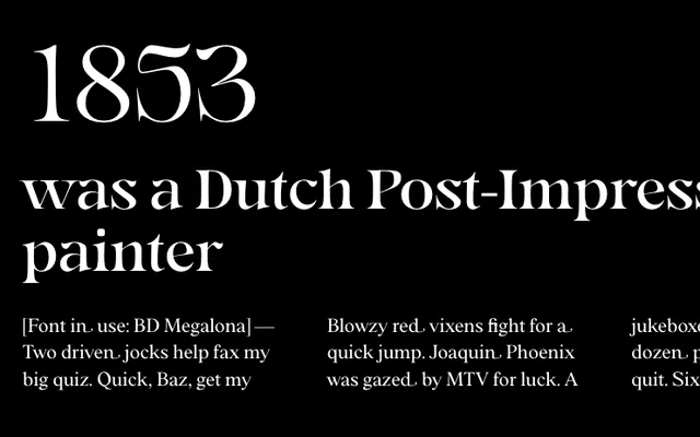
An experimental display serif with 14 weights and a variable axis, built around letterforms derived from the character 'r' and blending roman and gothic influences.
About
Gegor's letterforms originate from the shoulder and structure of the letter 'r', with that shape propagating across the alphabet to create a distinct internal logic. At heavier weights the shoulders become slightly pointy, while at lighter weights they curve, giving each end of the range a different character. The family ships with discretionary ligatures, case-sensitive forms, fractions and small capitals, alongside broad Latin multilingual coverage.
Classification
Described explicitly as an experimental serif display font with letterforms derived from the character 'r', blending roman and gothic shapes with distinctive pointy shoulders at heavy weights and curved forms at lighter weights.