 MegaMegaTypeType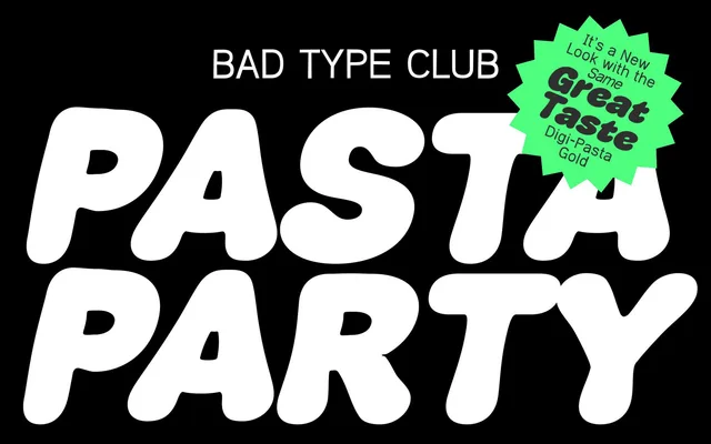
A two-style display family inspired by vintage pasta packaging, offering a quirky legible sans and a bold expressive companion for food, branding and packaging work.
About
Designed by Matt Scott Barnes, the family comprises two distinct personalities: Spaghetti Boy, a kooky yet readable sans-serif, and Sauce Man, a bolder, more flamboyant cut aimed at headlines and standout applications. The design draws from the charm of classic pasta box typography, lending it a retro food-brand sensibility suited to packaging, branding and fun editorial contexts.
Classification
A novelty display typeface with two distinct stylistic subfamilies — a legible kooky sans-serif and a bold expressive variant — both rooted in playful, illustrative lettering traditions inspired by retro pasta packaging.