displayhandwritten sans
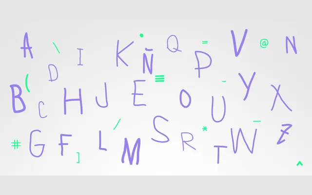
A rounded monoline display font with a handwritten, decorative character across four weights from Light to Bold.
About
Lamiar is built on a consistent monoline stroke with rounded terminals that give it an informal, hand-drawn feel. The four-weight range — Light through Bold — keeps its playful quality intact at heavier settings. It is intended for display use, where its idiosyncratic glyph construction reads as deliberately quirky rather than rough.
Classification
Described explicitly as a decorative, handwritten, rounded monoline sans-serif intended for display use. The informal, hand-drawn quality and monoline construction place it firmly in the display category with a handwritten sans subcategory.
Weights
LightRegularMediumBold
Languages
Latin
Tags
handwrittenroundedmonolinedisplaydecorativeplayfulfunsans-serif