ANFCo Stoakes
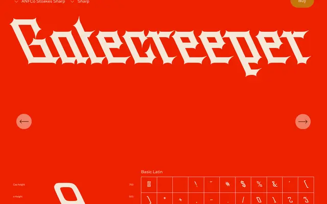
A revival of J.W. Stoakes's 1891 Automatic Shading Pen lettering, with three subfamilies expanding on the original's straight-lined, leftward-leaning script into worn and gothic-inflected sharp variants.
About
The design draws directly from a lettering manual published by the J.W. Stoakes Automatic Shading Pen Company, preserving the original's unconventional leftward lean and geometric uniformity while making minor adjustments for legibility. Three subfamilies extend the concept: the standard cut, a worn version that mimics weathered lettering, and a sharp version that amplifies the gothic undertones into something more imposing. Its consistent angles and geometric form make it well suited to stacked, shaded compositions as envisioned in the original 1891 manual.
Classification
Based on historic pen lettering with a pronounced leftward lean and straight-lined, blackface-esque construction, placing it in the display category with strong blackletter and script influences.