ANFCo Plain Grave
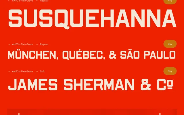
A display sans-serif revived from a hand-cut metalworks catalogue alphabet, retaining period quirks such as heavier horizontals and tight interior curves across two styles: Regular and Soft.
About
Drawn from lettering found in an old metalworks catalogue, the typeface tightens the original hand-cut forms without erasing their character. The heavier horizontals relative to verticals are an uncommon detail among sans-serifs and give the face a subtle tension. It suits labels, posters and badges where a restrained vintage quality is needed without overt period styling.
Classification
A display-oriented sans-serif drawn from a historical metalworks catalogue alphabet, with intentional structural quirks such as heavier horizontals than verticals and tight interior curves. These irregularities place it firmly in display rather than neutral sans-serif territory.