ANFCo Duronel
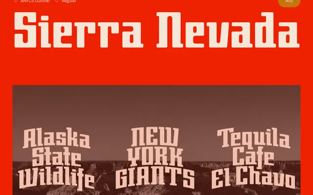
A single-weight slab serif drawn from the memory of an old electronics shop sign, combining blocky geometry with rounded corners and thick serifs.
About
The design sits somewhere between mid-century commercial lettering and something that might have passed for futuristic when it was first painted on a shopfront. Its sturdy, squared structure is softened throughout by consistently rounded corners, and the thick slab serifs give it a confident presence at display sizes. A full lowercase accompanies the all-caps optimised forms, and a generous set of discretionary ligatures allows letters to lock together cleanly across a range of layout contexts.
Classification
Blocky, upright letterforms with thick slab serifs and rounded corners place this firmly in the geometric slab category, reminiscent of mid-century signage lettering with a retro-futurist character.