APN Ochra
Alphabets Patrick Nell · Patrick Nell
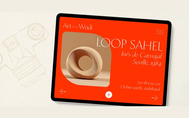
A slender, modulated display and titling sans-serif drawing on Quattrocento Florentine letterforms, diagonal stress and inscriptional detail, offered in Roman and Italic.
About
APN Ochra pairs the broad-nib logic and stress of its companion APN Chora with a lowered x-height, generous ascenders and subtly irregular forms that recall imperial Roman capitals and open Renaissance lowercase. The italic employs a bi-angular slant for measured dynamism without disrupting the typeface's calm authority. Despite its display focus, the family is comprehensively equipped with small caps, multiple figure sets, fractions, discretionary ligatures, stylistic alternates and extensive Latin-script language support.
Classification
A modulated (non-monolinear) sans-serif with inscriptional and glyphic traits, diagonal stress, and Renaissance proportions — designed explicitly for display and titling use. Its historical references to Quattrocento Florentine letterforms place it firmly in the display subcategory despite full lowercase and text features.