 MegaMegaTypeType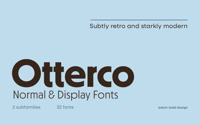
A theatrical, retro-leaning geometric sans, with a Normal cut for text and a tighter Display cut for headlines.
About
Otterco mixes subtly retro details with a starkly modern geometric structure across eight weights. The Display cut narrows spacing and increases width contrast for headline use, while Normal favours captions and larger text settings.
Classification
A theatrical geometric sans referencing early 20th-century models, with a Display cut tightening spacing and width contrast for headlines.
Weights
ThinExtra LightLightRegularMediumSemi BoldBoldExtra Bold
Optical sizes and widths
standardDisplay
Family
Otterco Display
Languages
Latin
Tags
geometricretrosans-serifbrandingheadlines