Gieo Text
ÁccentiaType · Linh Nguyễn · 2025
serifhumanist old-style serifitalic
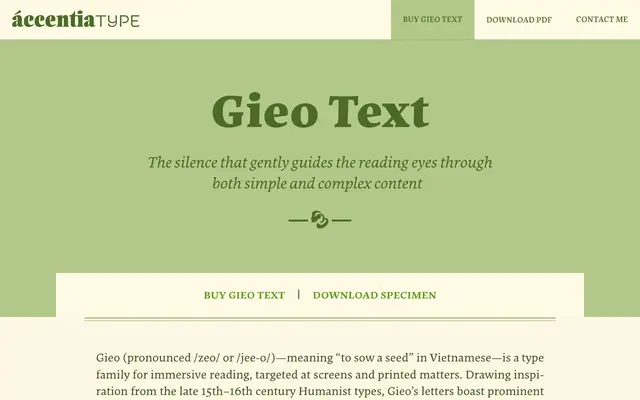
A humanist text serif with calligraphic, asymmetrical serifs and a quiet, unobtrusive character built for long-form reading.
About
Gieo Text draws on Venetian humanist models from the late 15th and 16th centuries, pairing gentle curves with sharp asymmetrical serifs and a right-leaning stem. Six weights from Regular to Black each carry a matching italic, and the design covers an extensive Latin character set including Vietnamese. It is built to stay out of the way of the reader rather than announce itself.
Classification
Drawing on late 15th to 16th century Venetian humanist models with calligraphic, asymmetrical serifs and a right-leaning stem, Gieo Text sits in the old-style serif category built for extended reading.
Weights
RegularMediumSemiBoldBoldExtraBoldBlack
Languages
Latin Extended
Tags
humanist seriftext typeeditorialcalligraphicreadingvietnamese-support