 MegaMegaTypeType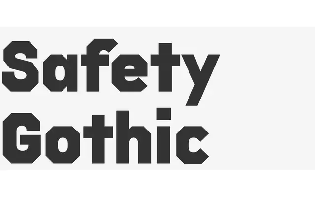
A five-weight geometric sans with an angular, safety-signage exterior wrapped around softer curved counters.
About
Safety Gothic takes its cue from a genre of 19th-century wood-type capitals, building a typeface with a sharp, angular exterior around curved interior counters. It runs authoritative and stable in all-caps across five weights from Light to Black, with a lower case whose apertures are cut at the same angle to keep the voice accessible. Every style carries OpenType fractions, case-sensitive punctuation and an extensive Latin character set including Vietnamese.
Classification
Angular geometric caps derived from 19th-century wood-type capitals, paired with a lower case cut at the same angle; no serifs, so it sits in sans-serif despite its industrial, signage-derived character.