 MegaMegaTypeType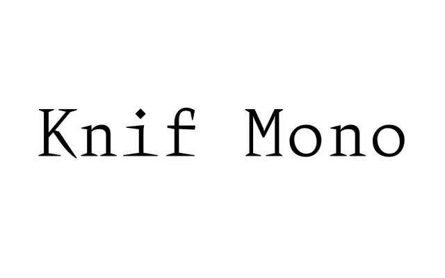
A monospaced slab with aggressively pointed serifs, developed in 2015 by Axel Pelletanche-Thévenart with Building Paris studio, released in roman in 2016 and extended with an italic in 2017.
About
The design began with a deliberate pursuit of a sharp, brutal aesthetic, with serifs pushed to blade-like points rather than blunt or bracketed forms. Capitals were refined away from Renaissance softness towards stronger, more severe shapes, and the italic – released a year after the roman – draws loosely on French Renaissance letterforms, most visibly in the lowercase g. Seven weights with matching italics make it a surprisingly versatile workhorse despite its extreme personality.
Classification
A monospaced typeface with sharp, pronounced serifs that give it a distinctive slab character. The extreme pointiness of the serifs and the overall geometric rigidity place it firmly in the monospaced slab category.