 MegaMegaTypeType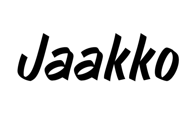
A single-weight display typeface drawn from Finnish commercial lettering guides, digitised with deliberate imperfections from a flat brush and marker process.
About
Inspired by a Finnish instructional book for lettering artists painting commercial inscriptions, the typeface was sketched with a marker before being digitised, with corrections applied in white that remain visible in characters such as the ampersand. Considerable attention was paid to balancing the angles of individual letters to produce an even texture across a setting, allowing it to function at text sizes as well as at display scale. The imperfect junctions of its shapes are most legible and characterful at large sizes.
Classification
Drawn with a flat brush and marker, then digitised, giving it a strong handwritten character with visible imperfections. Classified as display due to its origins in commercial lettering and its best performance at large sizes.